
Baltpool
Transparent energy trading system
Moira Visuals developed a digital identity for Baltpool, a state established biofuel exchange platform operating at the core of Lithuania’s energy market. The project focused on shaping a clear, neutral, and result oriented identity that supports transparent trading, balanced market relations, and data driven decision making. The identity was conceived as a functional digital system, designed to operate reliably within a regulated environment while remaining accessible to daily platform users.

Client and Collaboration Overview
Baltpool operates as a national level energy trading platform, where institutional responsibility, regulatory compliance, and operational clarity are critical. Our collaboration focused on translating complex auction based trading processes into a visual language that communicates trust, neutrality, and systemic balance. The work required close alignment between platform logic, user interaction patterns, and institutional communication standards. Design decisions were evaluated through the lens of real usage scenarios, ensuring that the identity supports both professional stakeholders and everyday system users. The outcome was positioned as part of a broader digital ecosystem rather than a standalone visual asset.


Project Objectives
The primary objective was to visually express result orientation, transparency, and equal positioning between buyers and sellers within an anonymous trading environment. The identity needed to reflect a fair and impartial auction model without introducing emotional bias or visual dominance. Another key goal was to support clarity and ease of use in digital contexts, enabling fast comprehension of data, processes, and outcomes. The system had to communicate energy flow, movement, and structured decision making while maintaining institutional stability and long term usability.


Project Outcomes
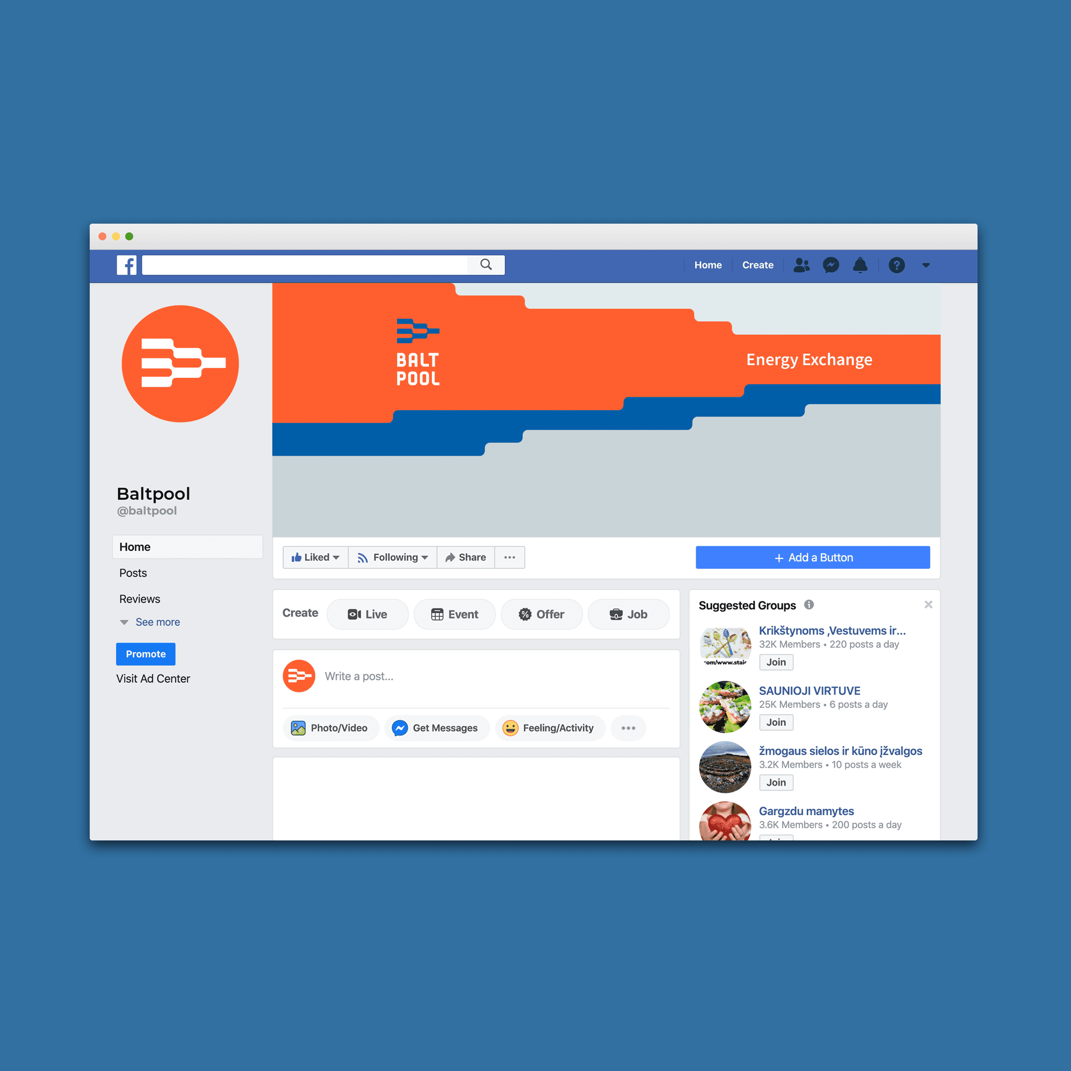
We created a modular identity system built on visual metaphors of energy flow, data movement, and natural resource cycles. The logo and graphic elements draw inspiration from tree branches, roots, river currents, and schematic energy systems, forming a coherent and functional visual language. The color system combines orange to represent energy and active processes, blue to convey stability and trust, and grey to support digital clarity and data presentation. The identity includes logo design, typography selection, icon systems, and visual assets for documents, charts, and digital communication. The system was implemented across the website, social channels, electronic documents, and newsletters, ensuring consistency, scalability, and long term relevance.

Date: 2019-11-11