
Fake News
Exhibition Visual Identity
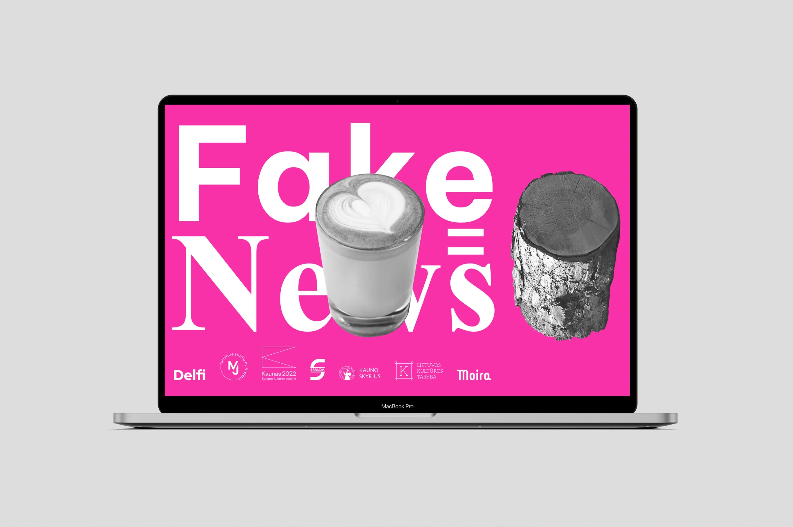
We developed a comprehensive visual identity for the Fake News exhibition, a project where artists critically engaged with misleading articles from Delfi.lt and reinterpreted them through their creative practice. The identity was designed to reflect the exhibition’s conceptual premise, supporting the exploration of how fiction, misinformation, and factual content intertwine. By translating these abstract themes into visual language, the design functions as both a communicative tool and a framework for the exhibition’s narrative.


Client and Collaboration Overview
The Lithuanian Artists’ Union, Kaunas branch, commissioned the visual identity to complement the artists’ critical investigations of misinformation. Collaboration was exploratory and iterative, reflecting the layered and unpredictable nature of fake news. Rather than imposing a rigid visual system, we approached the identity as a responsive structure, attentive to the curatorial theme and the individual perspectives of participating artists. Dialogue with the organiser focused on amplifying the exhibition’s conceptual depth through design, ensuring that the visual language framed rather than overshadowed the artworks.




Project Objectives
The primary objective was to establish a visual language that embodies the tension between reality and fabrication. This required a flexible and adaptable identity capable of functioning across print and digital materials while maintaining conceptual consistency. The design needed to convey a human, approachable tone that resonates with the exhibition’s reflective and playful character, balancing gravitas with elements of surprise. Another key aim was to generate curiosity and invite interpretation, rather than presenting a predetermined message, thereby mirroring the exhibition’s critical engagement with perception and truth.


Project Outcomes
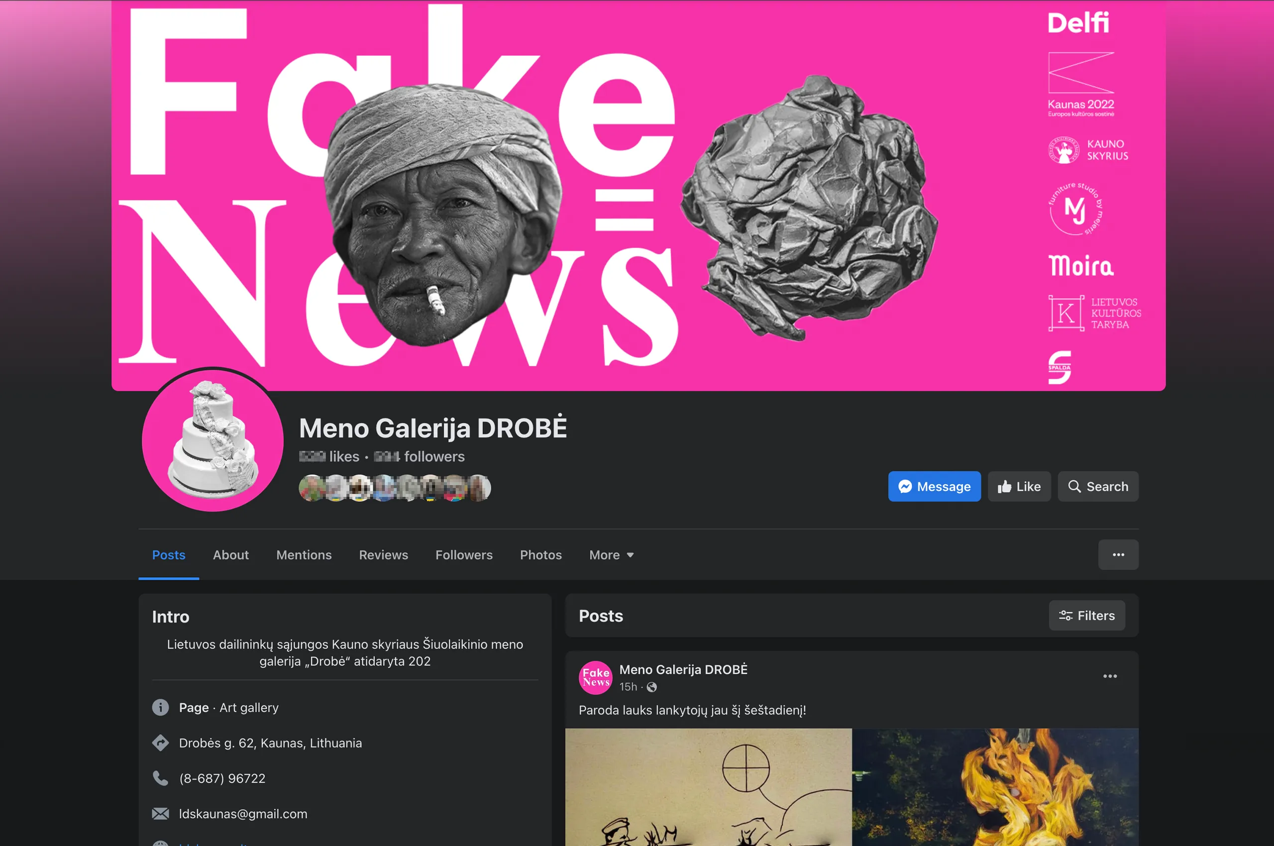
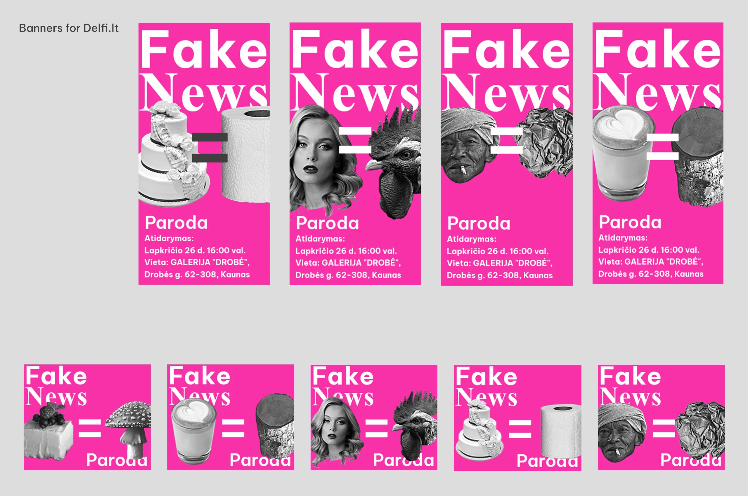
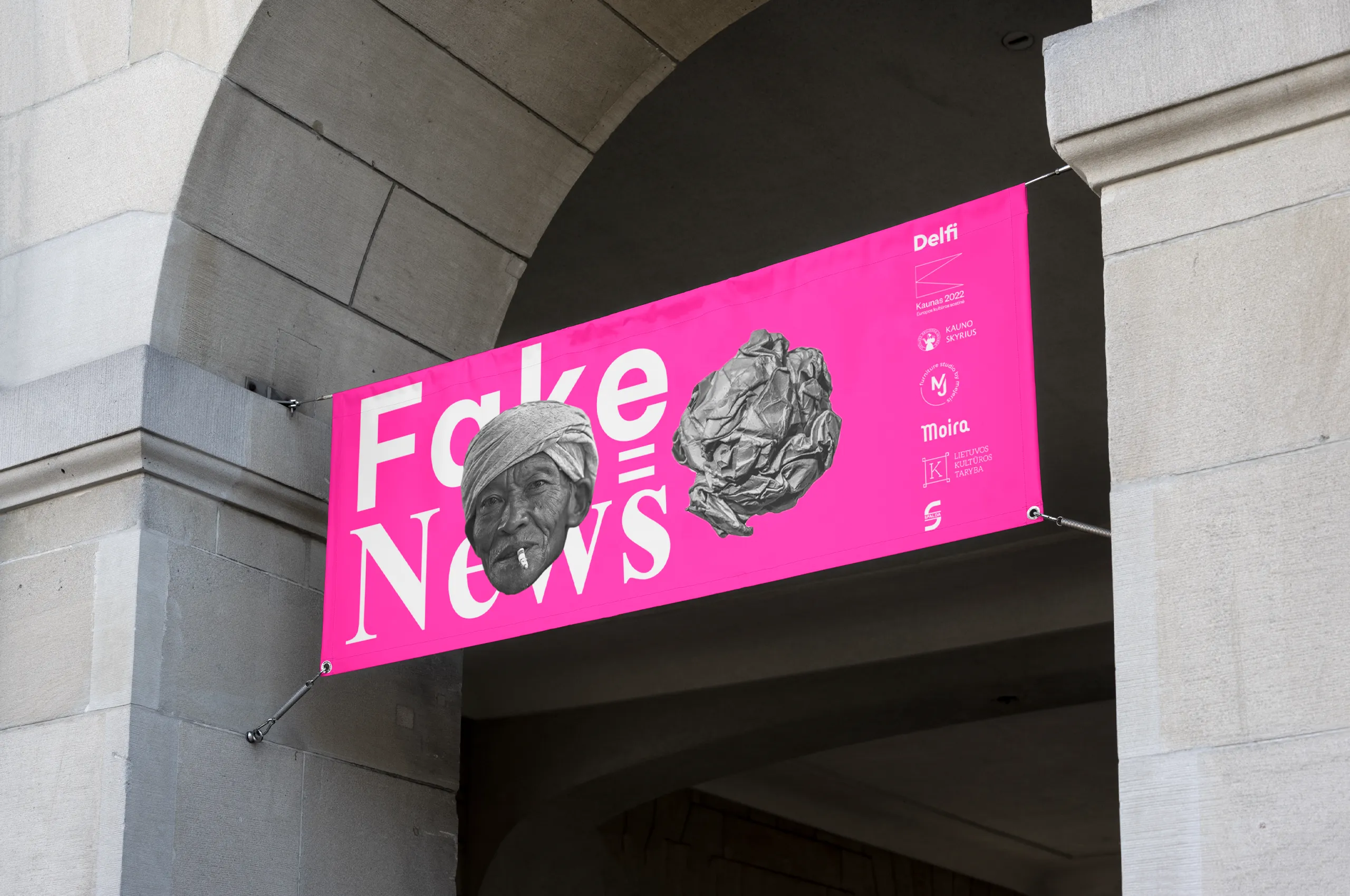
The visual identity employs a bright pink background as a central anchor, chosen for its emotional intensity and as a distinctive, memorable signal. Black and white objects sourced from a visual metaphor generator were integrated to create imagery that is both familiar and unexpected. These contrasts reflect the interplay of factual and misleading information, establishing a visual metaphor for the exhibition’s thematic concerns. The composition of elements, abstract yet referential, allows multiple interpretations and mirrors the audience’s engagement with the artworks. The identity maintains flexibility for application across various formats including promotional materials and exhibition environments, preserving coherence while supporting adaptive narrative expression.

Design Strategy Director: Marius Bartkus