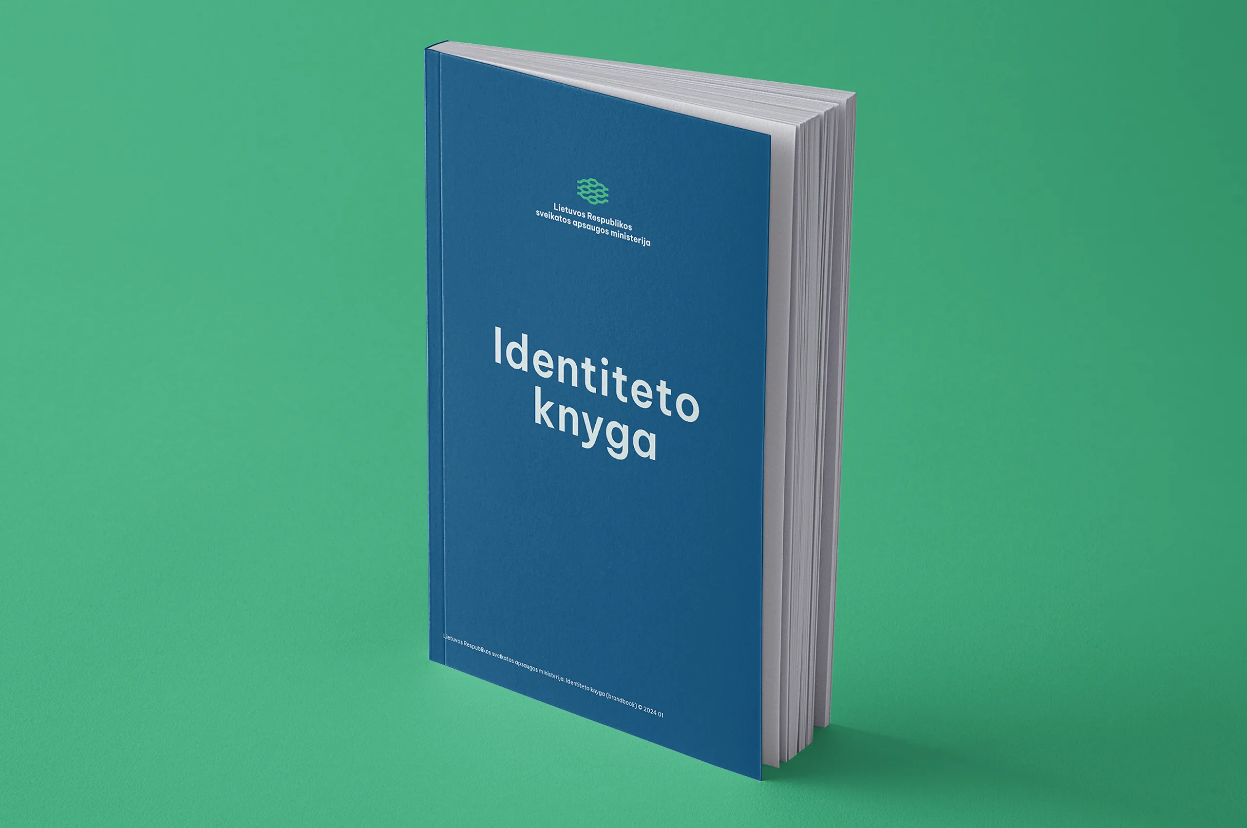
Ministry of Health of the Republic of Lithuania
Biological systems as governance language
After winning the official national identity design competition, Moira Visuals developed a future oriented public sector identity for the Ministry of Health of the Republic of Lithuania. The project redefined how a governmental healthcare institution can communicate complexity, responsibility, and human centered decision making in a digital and data driven environment.

Client and Collaboration Overview
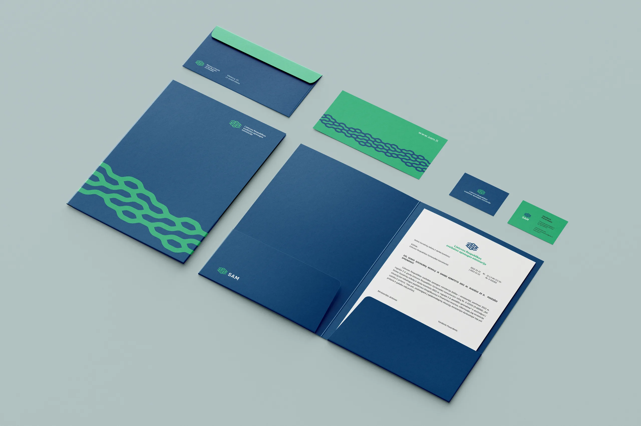
Moira Visuals was selected through an open national competition initiated by the Ministry of Health of the Republic of Lithuania. Following the competition, we collaborated closely with the Ministry’s design and evaluation committee to translate institutional, political, and regulatory complexity into a coherent visual system. The process combined analytical research, conceptual modeling, and design execution. The collaboration extended beyond visual form making into brand governance, system logic, and long term digital adaptability. Research and analytical input played a critical role in shaping the conceptual foundations of the identity. Continuous dialogue ensured alignment with public communication requirements, legislative frameworks, and evolving digital use cases.




Project Objectives
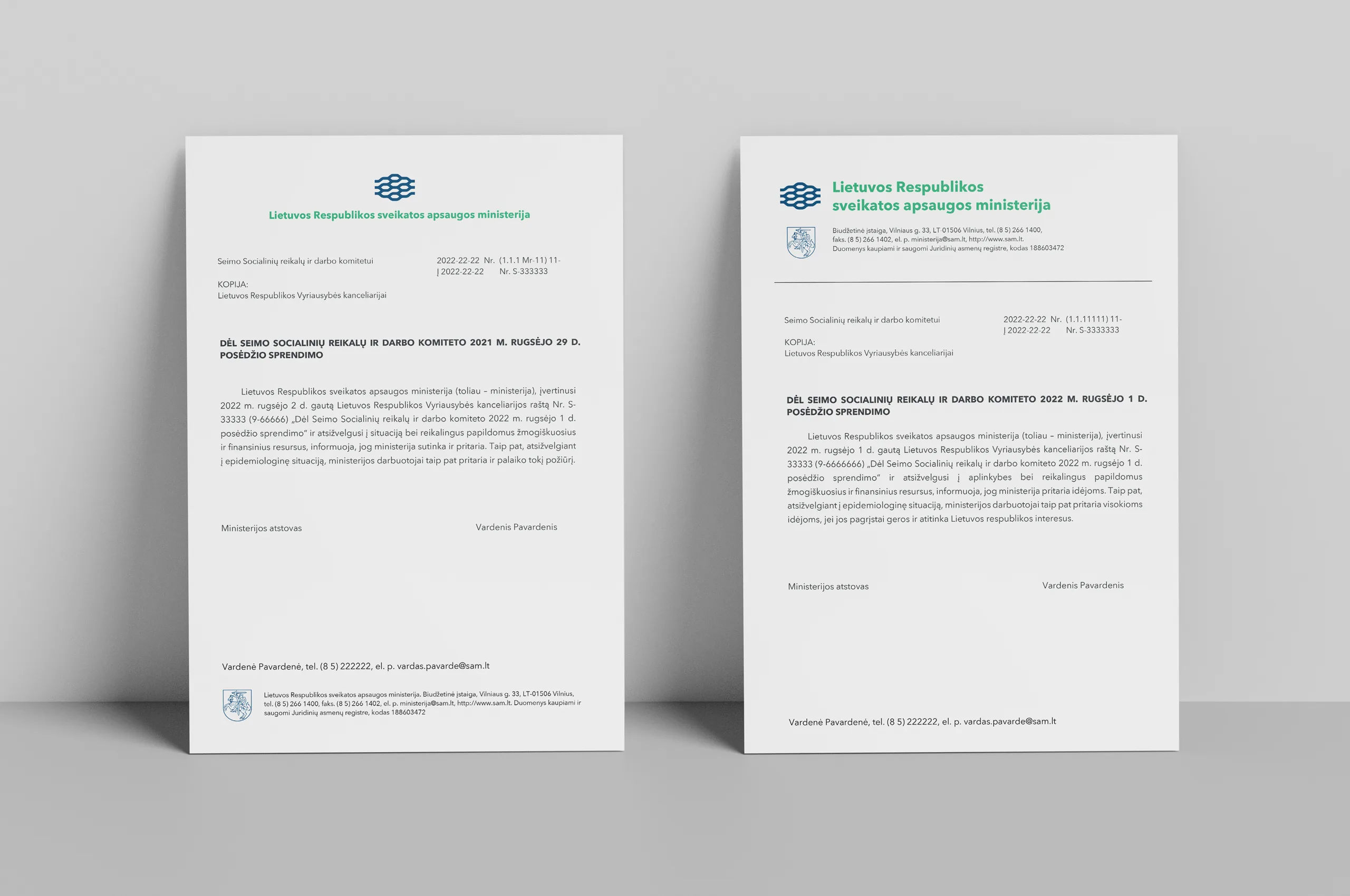
The primary objective was to create a distinctive and legally sustainable identity without relying on conventional medical symbols. Research demonstrated that commonly used healthcare icons such as crosses, snakes, or historical medical emblems are either legally restricted, overused, or semantically outdated. The identity needed to reflect contemporary healthcare as a complex ecosystem driven by science, research, policy, and data. A key goal was to visually express political decision making, information flow, and systemic responsibility within a public institution. The system had to remain human centered while representing a multi layered national healthcare structure. Digital first performance across UX and UI environments was essential. The identity was conceived as a flexible design system rather than a static logo.


Project Outcomes
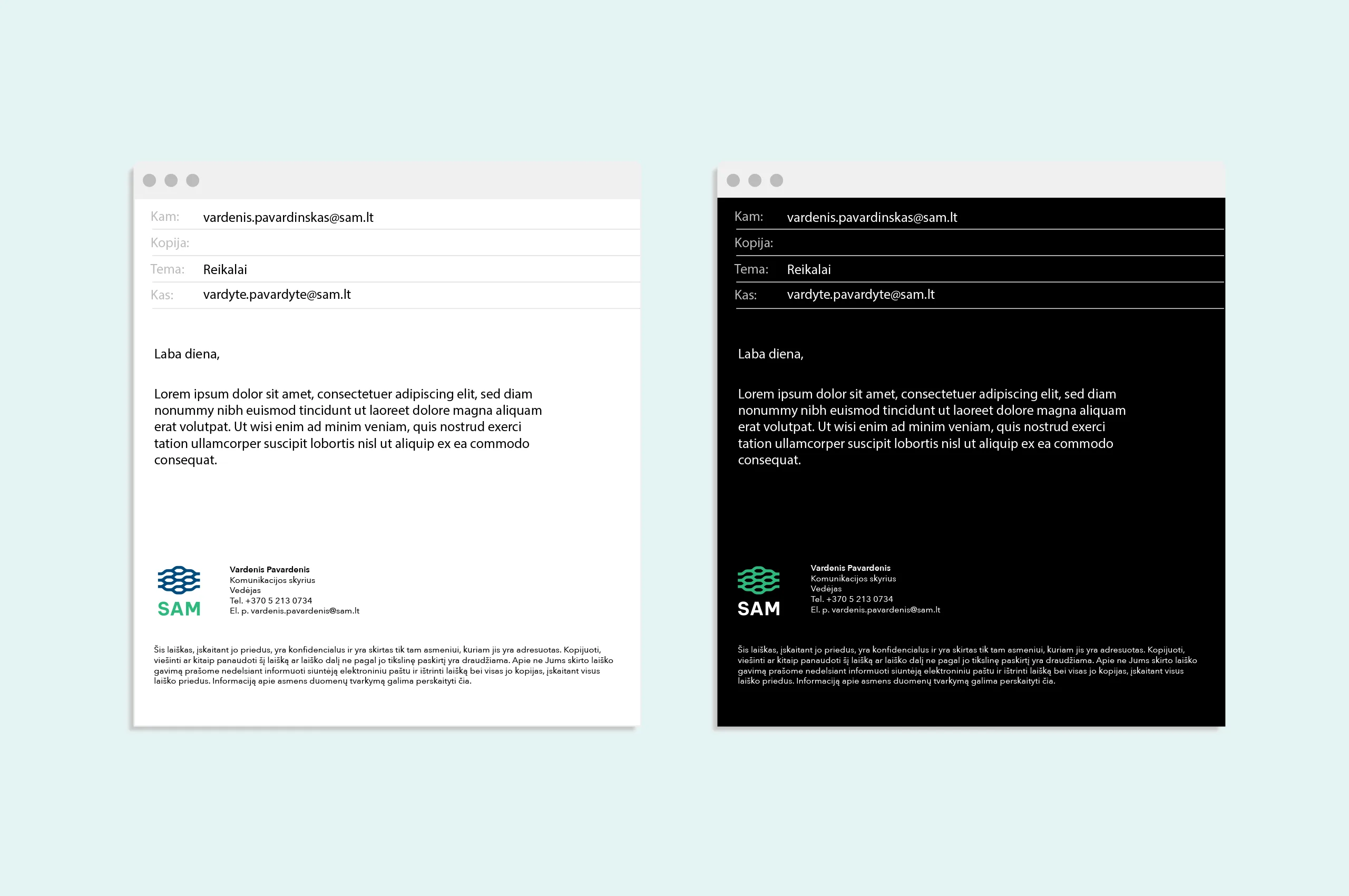
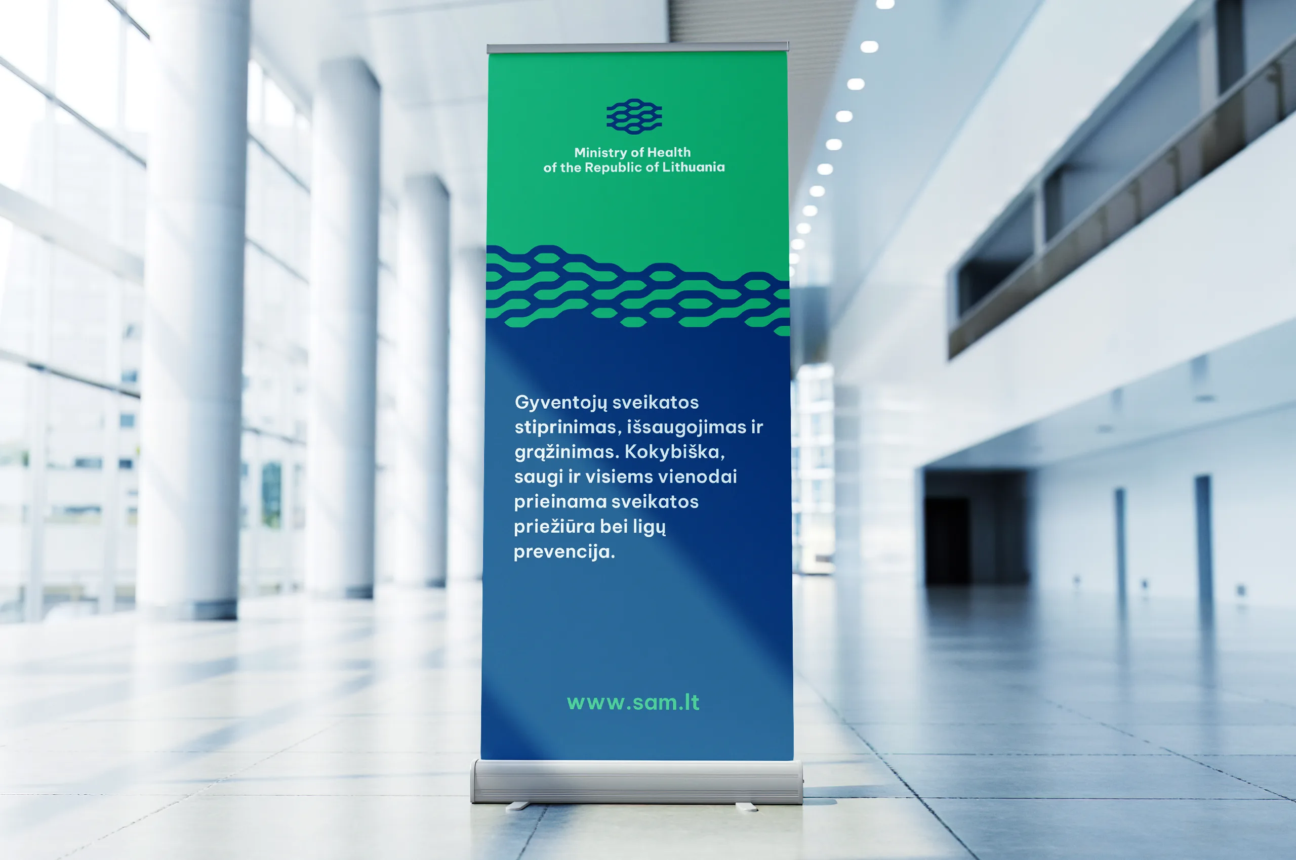
The final result is a biomorphic visual identity built from organic line structures inspired by human anatomy, muscular systems, neural networks, and biological information flow. These structures symbolize life, movement, control, and continuous adaptation. The nervous system metaphor reflects information transmission, reaction, and governance logic, aligning the identity with contemporary data driven and real time communication models. Subtle references to muscular structures convey strength, stability, and the capacity for action, while the internal logic of the form allows interpretation of political dynamics and decision processes. The structure also integrates microscopic biological principles, referencing chromosomal systems as a metaphor for complexity embedded within small components.


The identity avoids rigid geometry, emphasizing motion, transformation, and scalability. This enables the visual system to expand into generative patterns, digital ornaments, and adaptive layouts across platforms. A carefully developed color system based on green and blue establishes trust, calm, and institutional credibility. Red and orange function as contextual signals for alerts, risk communication, and emphasis without overwhelming the system.
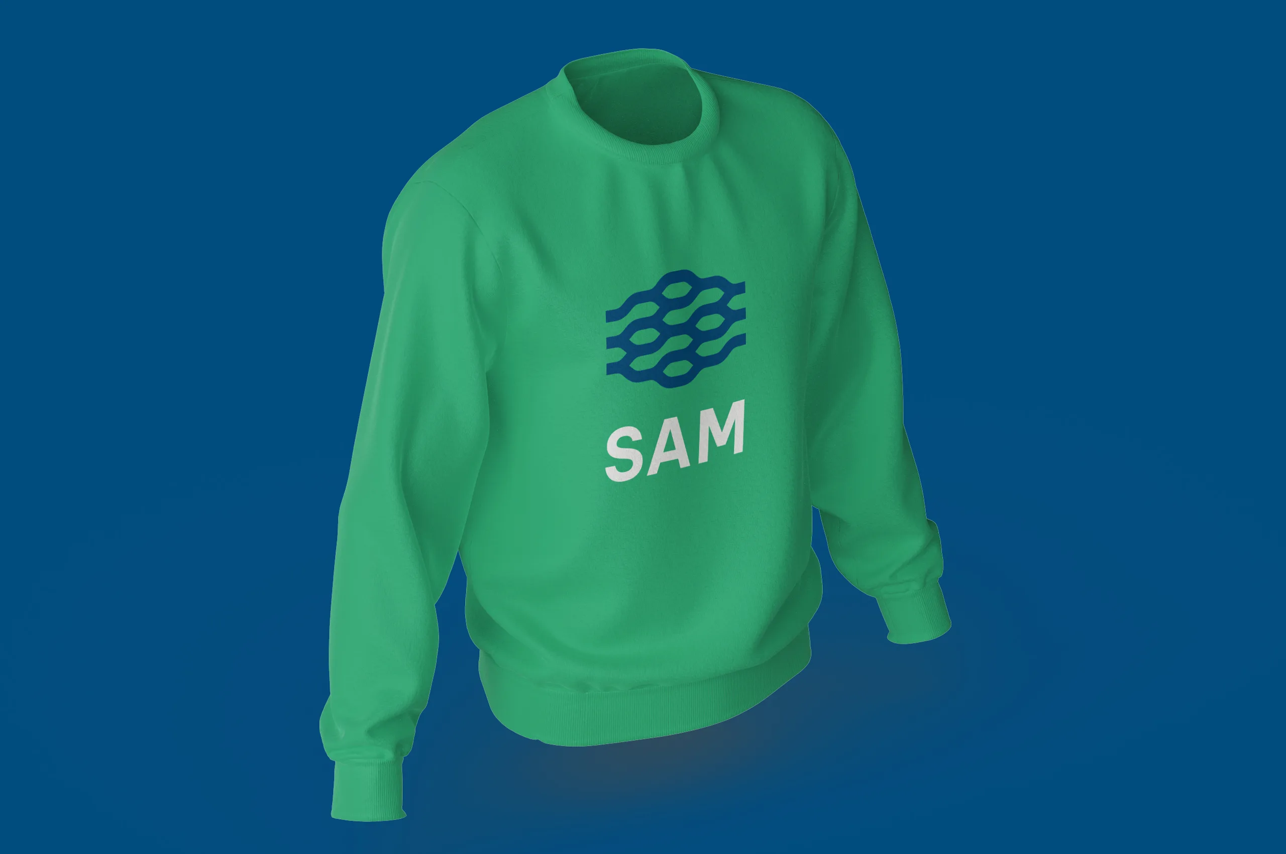


The outcome is a robust public sector brand system optimized for digital platforms, UX environments, data visualization, and long term institutional governance. It functions as an open visual framework capable of evolving alongside technological, societal, and healthcare system changes rather than as a fixed symbolic artifact.




Design Strategy Director: dr. Marius Bartkus
Design Researcher: Dr. Sigitas Gužauskas
Junior Designer: Polina Evdokimovich
Year: 2024