Belamu
Beauty brand naming and identity
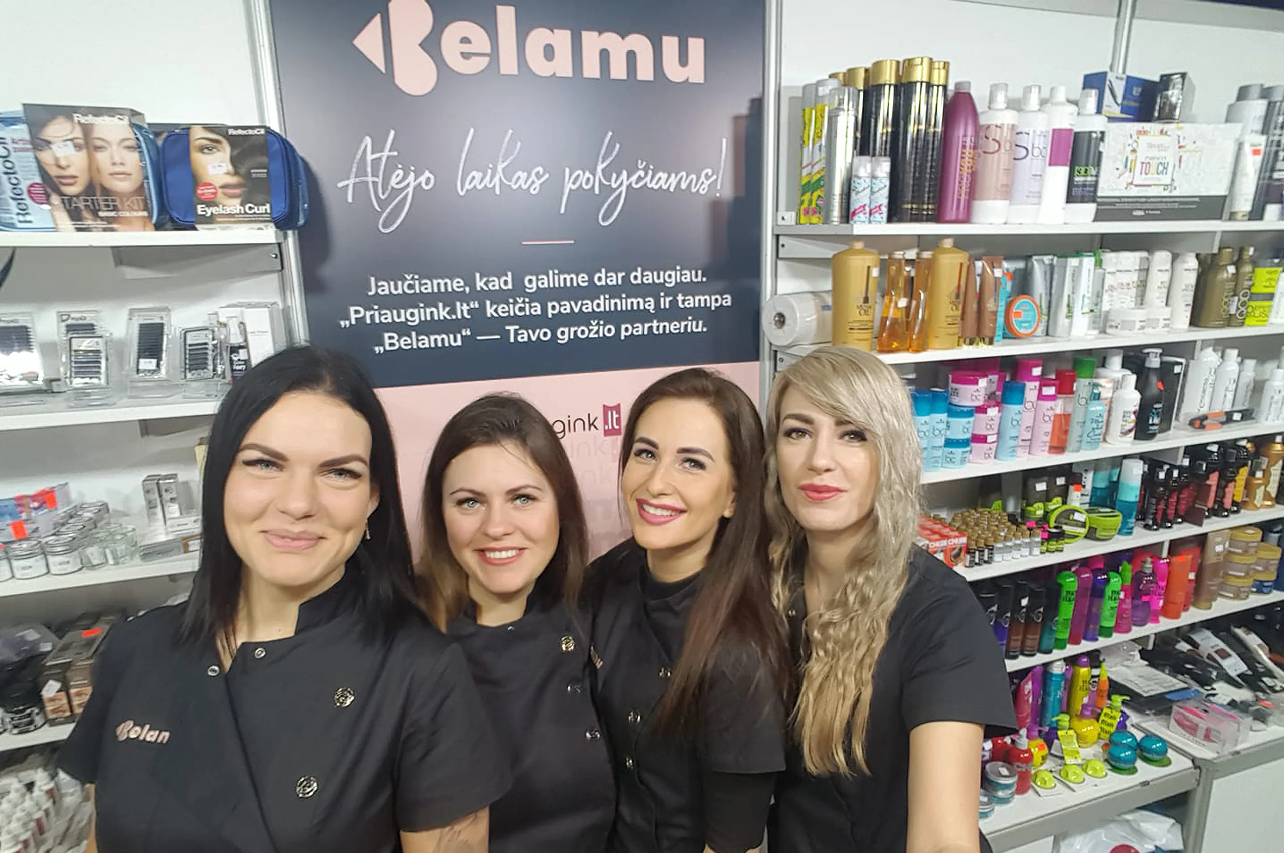
Moira Visuals developed the brand name and visual identity for Belamu, a fast growing cosmetics and beauty brand operating both online and through physical retail. The identity was designed to support brand scalability and international market expansion.

Client and Collaboration Overview
Belamu, previously known as Priaugink.lt, approached us during a transition from a niche eyelash focused business toward a broader beauty retail brand. The collaboration focused on understanding the brand’s origins, product expertise, and relationship with its customers. Particular attention was given to how the brand appears in everyday customer touchpoints such as social media, online stores, packaging, and beauty education materials. The visual language needed to feel friendly and personal while remaining professional and credible. Design decisions were tested across small scale digital environments where recognisability is critical. The process was iterative and grounded in real business use cases rather than abstract branding concepts.


Project Objectives
The main objective was to create a new brand name and identity that reflects both emotional warmth and commercial ambition. The logo needed to be distinctive, memorable, and adaptable across digital and physical applications. Colour choices were required to reference the brand’s origins in eyelash and mascara products while supporting a broader beauty category. Typography and graphic elements had to balance softness with clarity and professionalism. The identity needed to function consistently across social platforms, packaging, ecommerce environments, and printed materials such as training certificates. A key goal was to communicate trust, care, and long term partnership, aligned with the brand promise “Your Beauty Partner”.
Project Outcomes
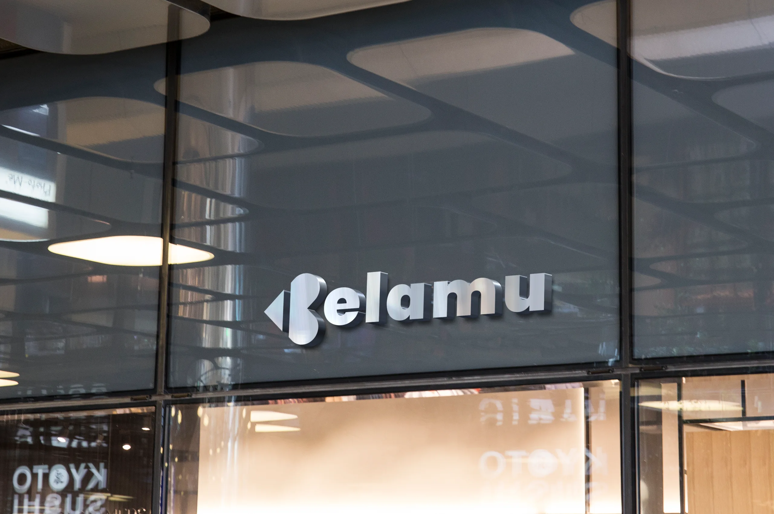
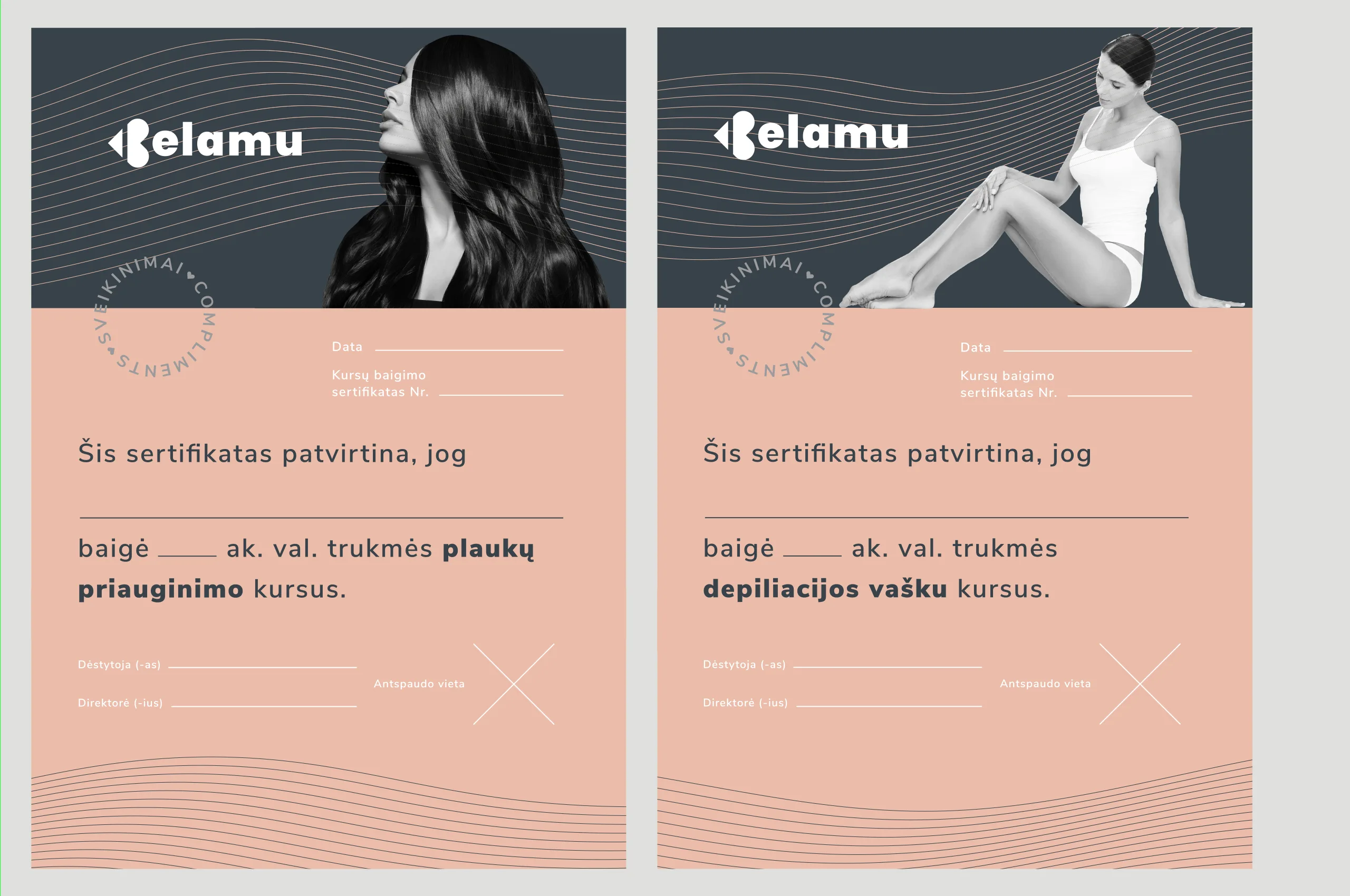
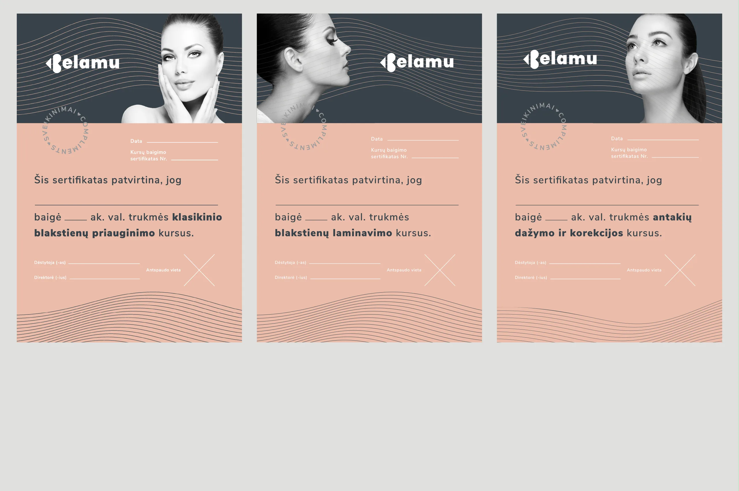
We created the name Belamu, a distinctive and easily memorable brand that conveys charm and beauty. The logo features a stylised feminine kiss or cupid inspired form shaping the letter B, designed to function as both a logotype and compact icon. The colour palette combines nude tones referencing the human body with graphite black inspired by mascara, connecting the brand’s origins with its future direction. Flowing graphic wave elements suggest hair strands and gentle movement, reinforcing a soft and elegant visual identity. Typography supports approachability while maintaining professional credibility. Packaging, certificates, and digital applications were designed as part of a unified system. The final identity is flexible, recognisable, and built to scale across markets and platforms.

Design Strategy Director: Marius Bartkus
Junior Designer: Greta Kalitončikaitė
Year: 2019