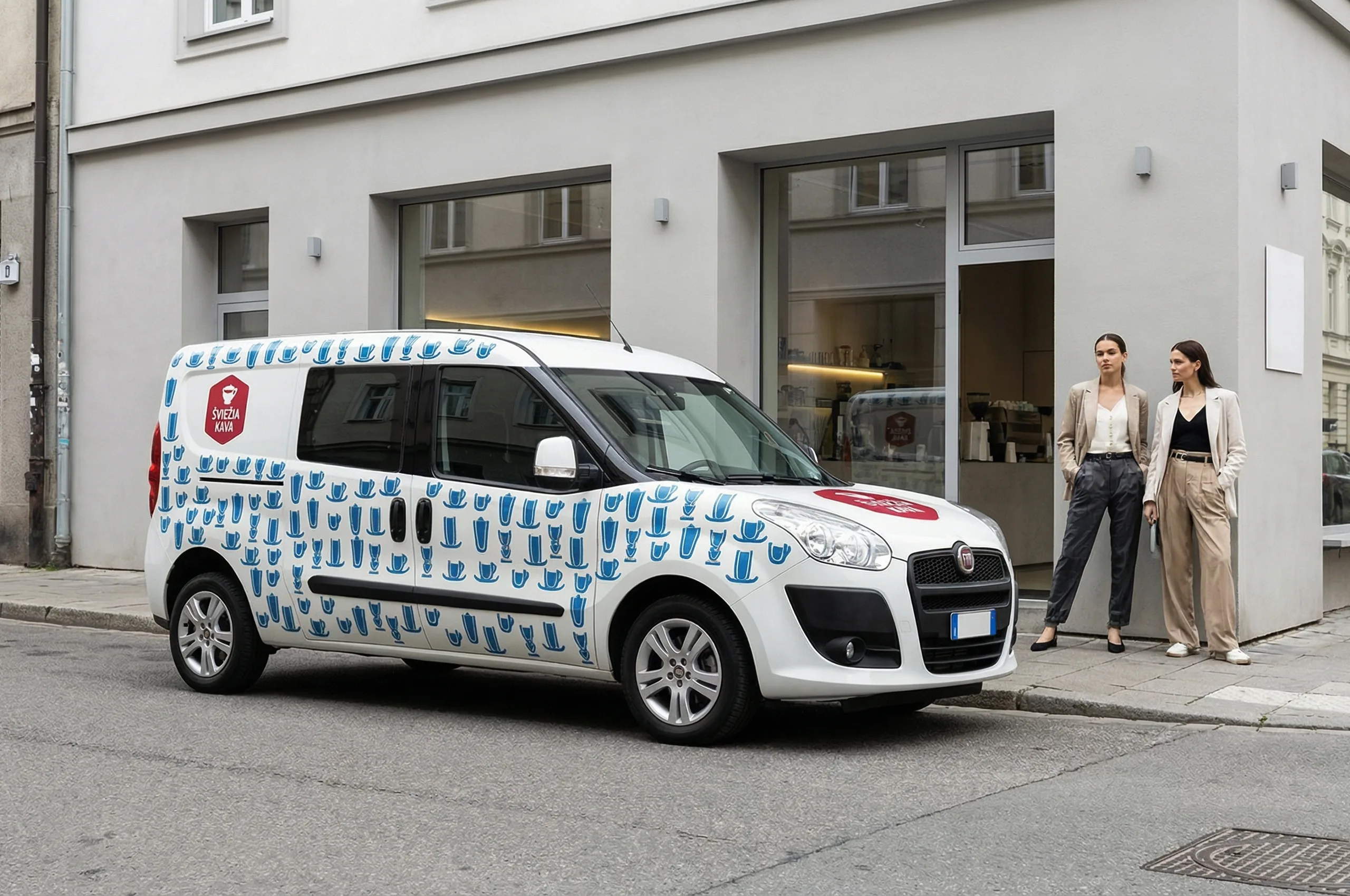
Šviežia kava
Expressive Coffee Brand Identity
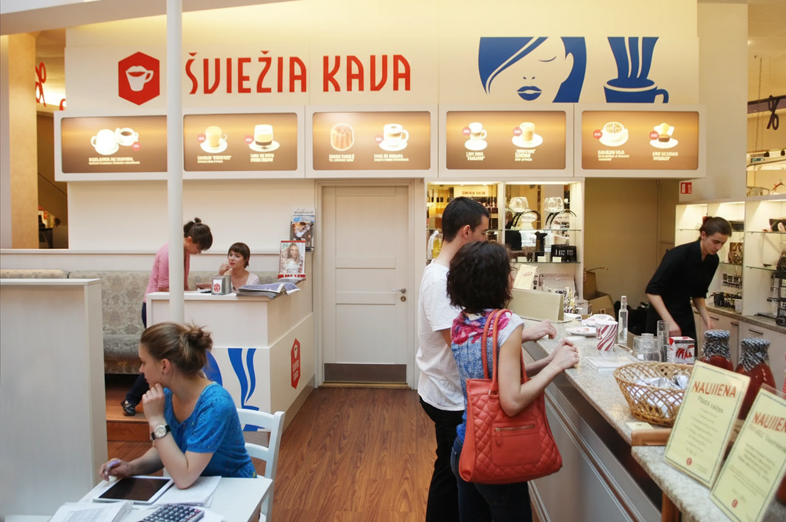
“Šviežia kava” was one of the largest Lithuanian coffee roasters, importers, and traders, and at the time also operated its own café network. The brand required an identity that could function consistently across retail products, physical café interiors, and promotional communication. In 2017 the company rebranded and continued operations under the name “Huricane Coffee”.


Brand strategy and visual concept
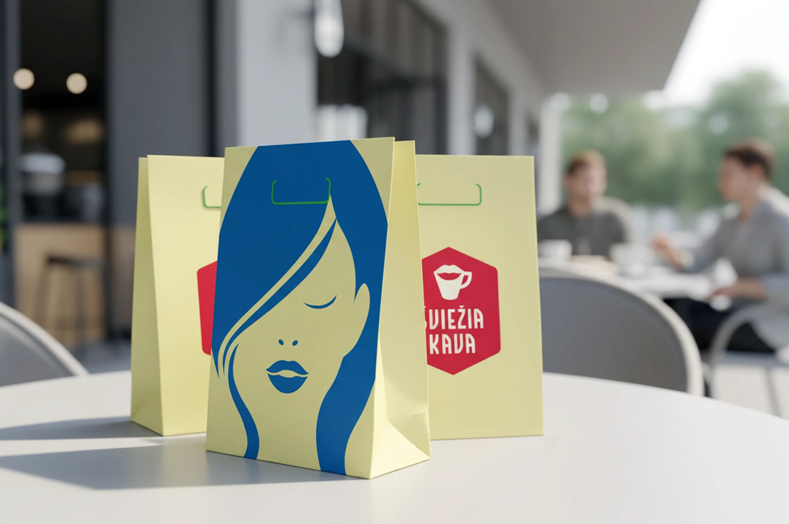
The logo was redesigned by carefully evolving elements from the previous identity, including colours, shapes, and typographic details, in order to preserve brand recognition and visual continuity. The cup symbol was reinterpreted using lips and a moustache, creating a memorable and human visual metaphor closely related to coffee culture. The colour palette was inspired by national and cultural colours typical of exotic coffee producing regions such as Cambodia, Puerto Rico, and Peru. These vivid, expressive colours intentionally contrast with Lithuanian and Scandinavian branding traditions, where muted and calm palettes are more common. At the time, such colour coding was unusual in local branding and helped the brand stand out strongly in the market.
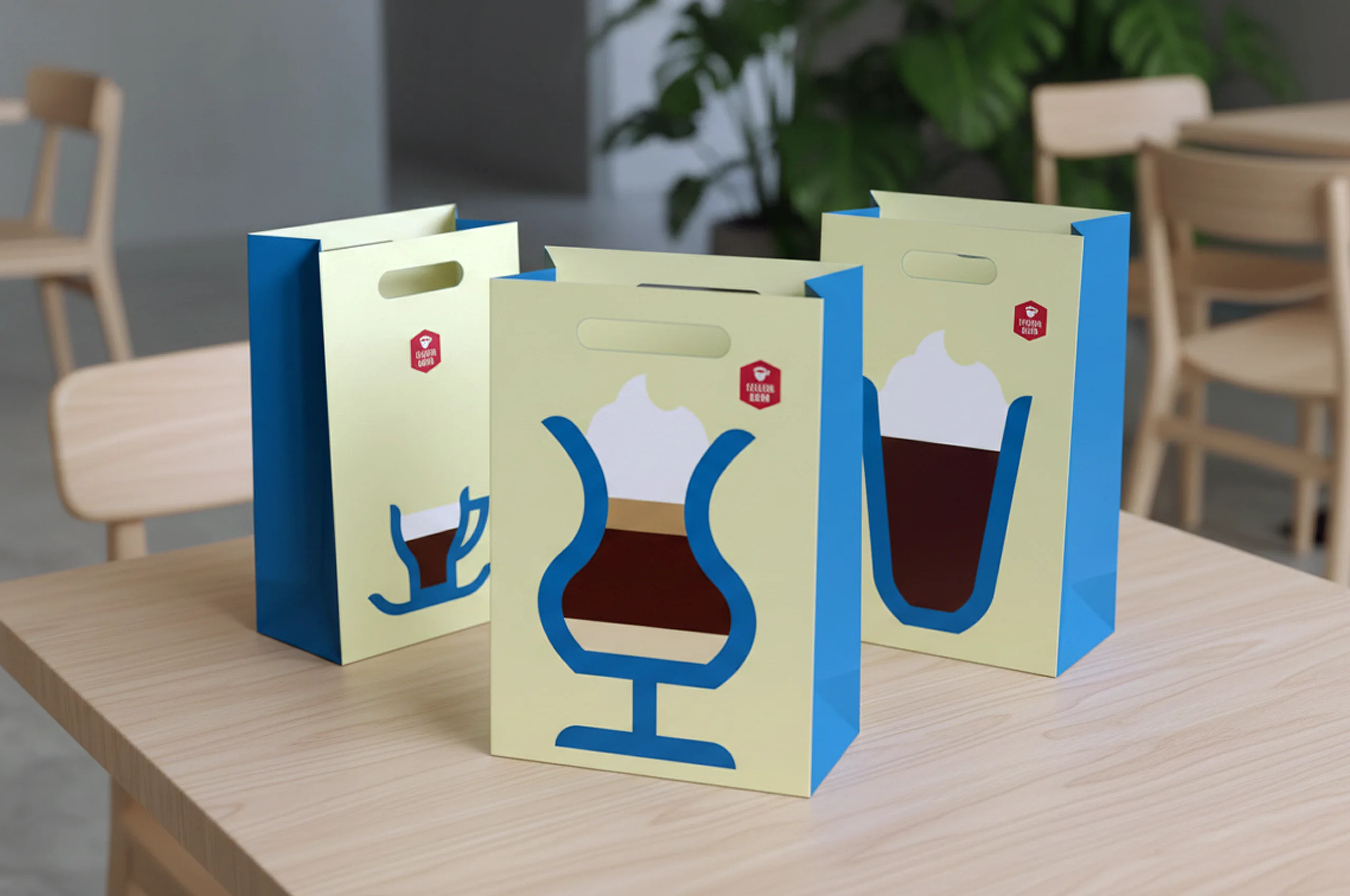


Typography and graphic system
Letterforms from the previous logo were reshaped and reused to create a custom font and a consistent icon system. This approach ensured stylistic unity across all brand touchpoints while allowing flexible application. Icons and typographic elements were designed to be easily recognisable and functional in both print and interior environments. The system supported rapid visual communication in cafés and retail settings.
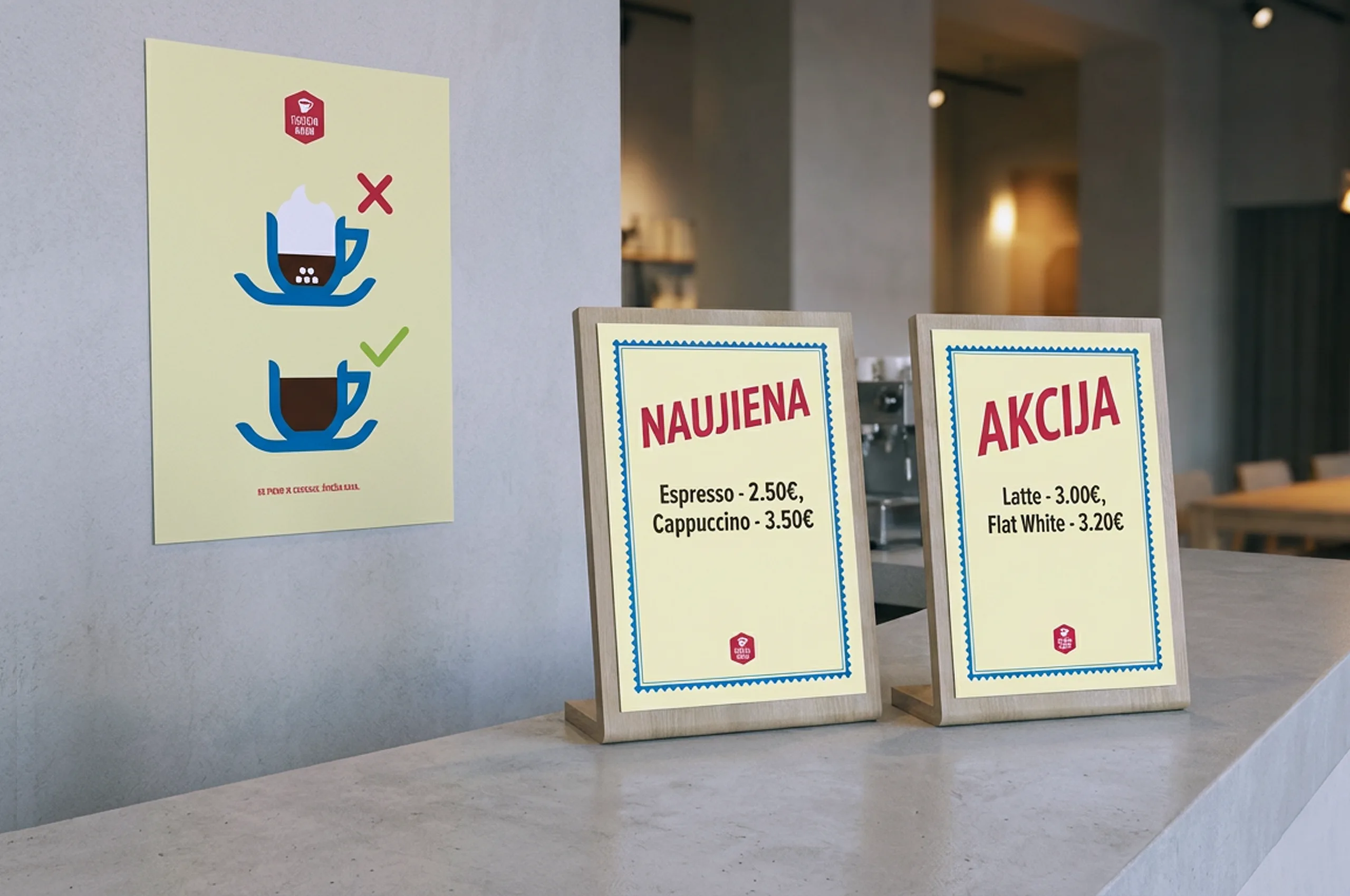

Identity applications and outcomes
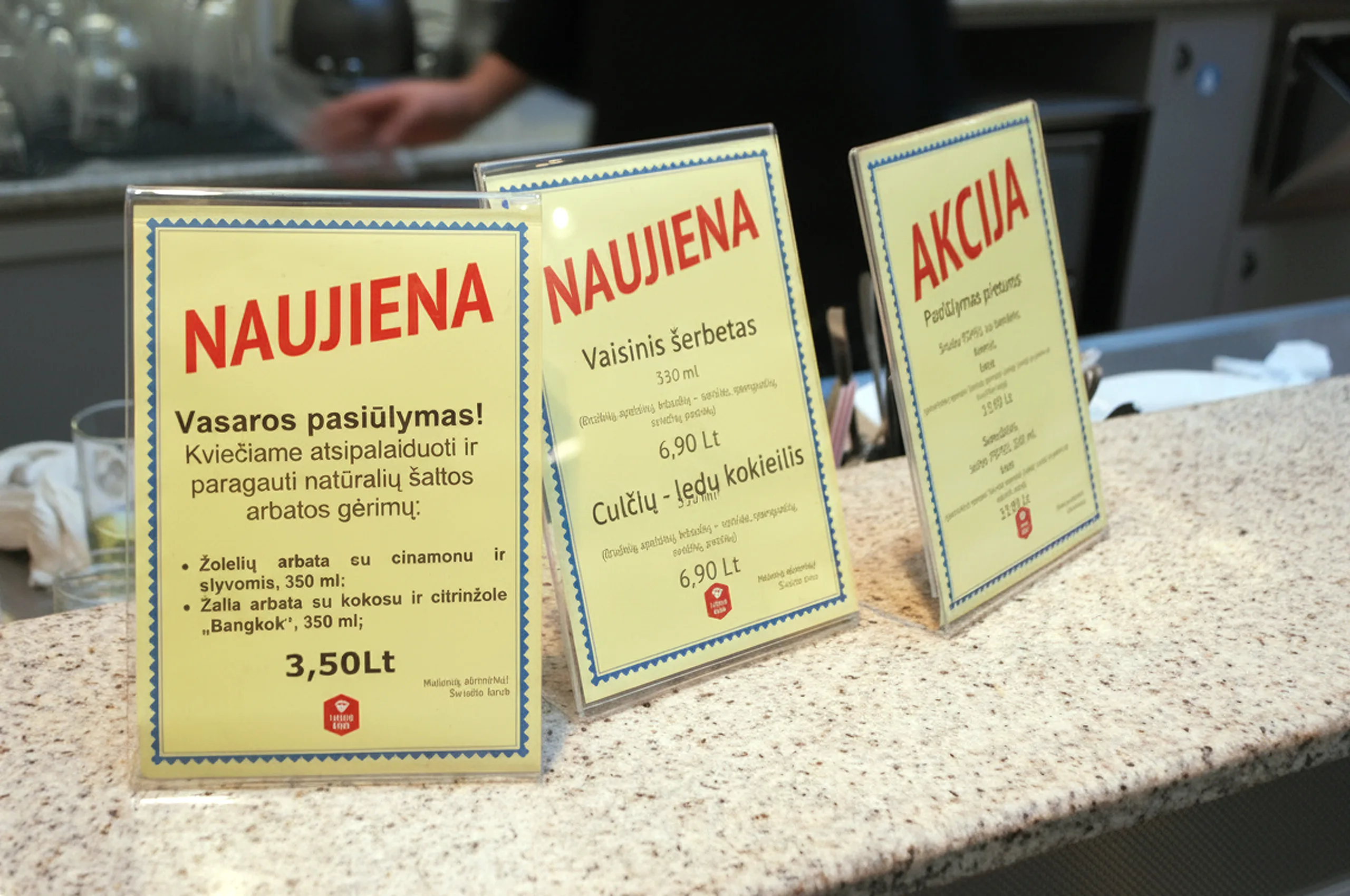
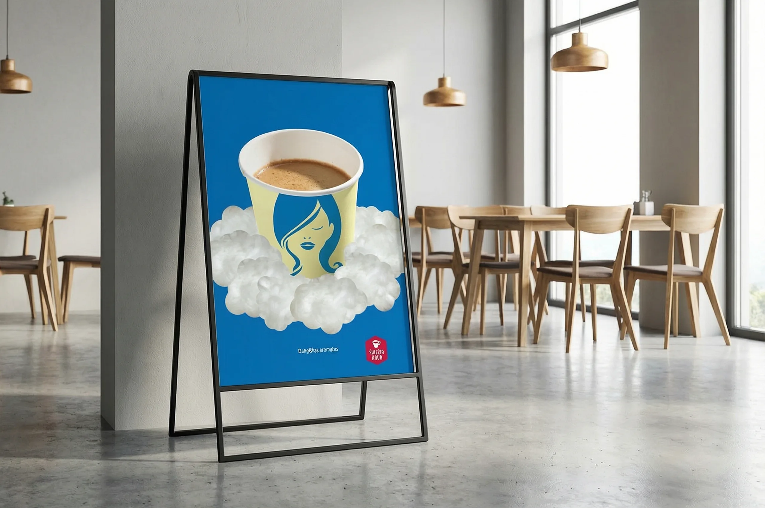
The identity was applied across a wide range of physical and digital materials, including coffee packaging, boxes, stickers, cups, menus, discount systems, promotional posters, navigation icons, and café interior elements. Colour coding was also used to support menu logic and product differentiation. The result was a bold, expressive, and culturally distinctive brand identity that reinforced product quality, origin, and character across multiple customer touchpoints.